Xenographics

Weird but (sometimes) useful charts

  • Home
  • About
  • Submit
  • Tags
    • correlation
    • distribution
    • domain specific
    • geo
    • hierarchy
    • high dimensional
    • mashup
    • network
    • scale stacking
    • time
  • Articles
    • On Graphonyms: the Importance of Chart Type Names
  • Contact

Gap chart

21st April 2018maartenzam
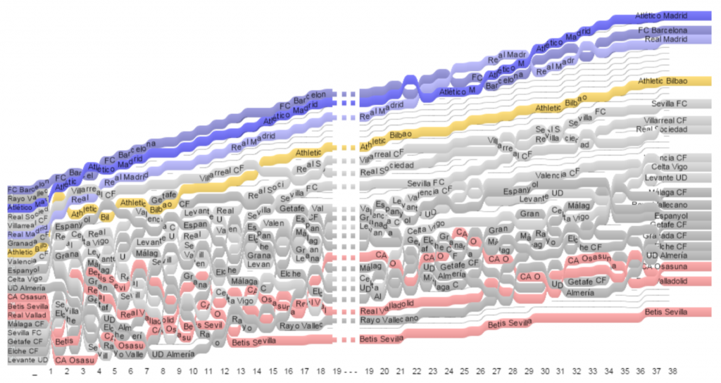
Line charts designed for visualizing the evolution of rankings over time, with a particular focus on sports data. Gap Charts show entries, e. g., teams participating in a competition, that are ranked over time according to a performance metric like a growing number of points or a score.
Using Gap Charts to Visualize the Temporal Evolution of Ranks and Scores

Post navigation

Durov diagram
Time curve
Copyright © 2023 Xenographics.
Theme Highriser by ThemeMunk. Powered by WordPress.